IT warning banners: How GSA is working to stop unnecessarily frightening users
Does your agency use a pop-up, modal, or overlay to present its IT warning banner (system use notifications) to users? The U.S. General Services Administration (GSA) did.
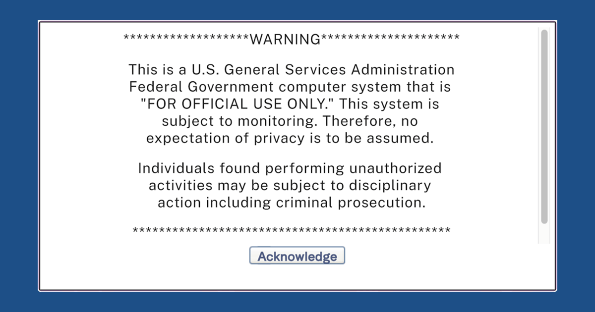
In fact, 34% of GSA’s public-facing websites contained some version of the following warning banner:

In September 2023, the Office of Management and Budget (OMB) issued M-23-22, Delivering a Digital-First Public Experience, which provides further guidance to help agencies fully implement 21st Century IDEA. The law and policy guidance collectively establish a framework and the requirements for a digital-first public experience.
The M-23-22 memo advises agencies on how to handle system use notifications.
Section III(A)(2), Reduce user friction by limiting warnings, says:
Agencies should avoid the use of unnecessary pop-ups, modals, overlays, interstitials, and other messages that interrupt the user experience and impede the user from completing a task, unless it is a necessary part of the design of the user experience.
And section III(A)(2), Do not alarm or frighten your users in ways that erode trust, says:
Agencies should consider how legal, security, and error messages are presented and conveyed to users.
“ The warning message reads like a ‘no trespassing’ sign. It’s an unwelcoming signal. ”— GSA employee
With that in mind, we worked with GSA’s Tech Law Division and GSA IT Security to update the agency’s policies to be consistent with M-23-22. The following updated guidance was provided to GSA websites managers:
- For public websites, systems, and applications like Digital.gov where users do NOT register or log in: Don’t actively present a warning banner to users; instead, link to GSA.gov’s Privacy and Security policies. GSA websites that leverage the U.S. Web Design System identifier component already satisfy this recommendation, as shown below. No additional System Use Notification is required.

- For public websites, systems, and applications where users register or log in: Display system use language with the terms and conditions the user must agree to. The example below from Login.gov presents the Rules of Use at account creation. This method satisfies the acknowledgements required from users that the system they’re using will be monitored, and ensures they are aware that they’re accessing a federal government system every subsequent time they log in.

This work is a great example of a policy tweak that can be immediately applied to public-facing websites to improve user experience.
Thank you to everyone who had a hand in implementing this change: GSA Tech Law Division, GSA IT Security, GSA Service Delivery team, GSA User Experience team, and GSA’s Digital Council User Experience working group.

