User Experience
User experience involves every interaction a user has with an agency.
Websites and digital services provide better results when they are designed and delivered with the user in mind. In the current digital landscape, it is critical to adopt a user-centered approach to understand and respond to the individual needs of users. By evaluating the user experience on federal websites and digital services, agencies can increase customer satisfaction, build public trust, and reduce burden on the public.
Related Policy
21st Century IDEA & M-23-22

User experience: Essential knowledge
-
How to apply user experience principles and methodologies to deliver results
Learn from case studies and best practices from federal UX practitioners to drive innovation through inclusion.
-
An introduction to design
Understand how and why design impacts user experience.
-
DHS usability testing kit
Use the kit’s guidelines and templates to test the usability of your services and solutions.
-
U.S. Web Design System: Design principles
Align on common goals and drive better user experiences on government websites.
-
18F Methods: Human-centered design tools
Use this collection of tools to put human-centered design into practice. They are focused on digital services, but can also be adapted to non-technical projects.
User Experience events
Spring 2024 Community Summit
USWDS Monthly Call - November 2023
USWDS Monthly Call - October 2023
User Experience news
Making the case for human-centered design: A Department of Justice case study
The Access DOJ initiative shares nine lessons on making services more accessible, effective, and efficient.
Delivering a digital-first public experience: One agency’s plan
Learn how the U.S. General Services Administration is tackling the 100+ requirements of OMB memo M-23-22, Delivering a Digital-First Public Experience.
How the Open Data, Design, and Development team implemented state and offshore region navigation pages with hallway testing
User feedback is key to creating great digital products, but limited resources can hinder research efforts. Hallway testing provides a quick, useful solution. By conducting informal interviews, the Open Data, Design, and Development team at the Department of the Interior gathered insights to improve navigation to state and offshore region pages on the Natural Resources Revenue Data website. After testing prototypes, the best option was implemented, streamlining access white minimizing resource use. The team’s next steps include monitoring performance, evaluating the addition of maps on select pages, and continued hallway testing.— via Office of Natural Resources Revenue

How multicultural research guides the USA.gov benefit finder
Discover how USA.gov tailors its benefit finder experience for both English and Spanish-speaking users through culturally nuanced content. Through dual-track language research, a bilingual support team, and A/B testing, USA.gov ensures that more users receive relevant, empathetic, and user-friendly content. The USA.gov team also identified and addressed recruitment challenges to interatively improve its ongoing research processes.— via USA.gov

User research and the Paperwork Reduction Act
User research is an important part of customer experience transformation. Different types of research require different approval under the Paperwork Reduction Act (PRA). Through seven case studies, the U.S. Digital Service shows how agencies conducted valuable user research that did not require PRA approval and successfully integrated findings into their projects. Their work illustrates how thoughtful user research transforms delivery of services and helps agencies build trust in government.— via U.S. Digital Service

Resources on User Experience
-
An introduction to privacy
Introductory guidance on implementing privacy protections for users of federal websites.
-
Lessons from the 2021 Federal Plain Language Report Card
This event recap highlights best practices, a short case study video, and examples of federal web content that received both high and low scores in the 2021 Plain Language Report Card.
-
Deceptive Design: How to Identify and Combat Consequence Design
Consequence design is part of everyday life. Techniques like “deceptive patterns” and “hostile design” trick people into taking unintended actions — learn how to prevent them from sneaking into our design work.
-
U.S. Web Design System
A design system for the federal government that makes it easier to build accessible, mobile-friendly government websites for the American public.
-
Department of Homeland Security: Usability Testing Kit
A resource with four approaches to help federal employees perform usability testing.
-
An advanced approach to accessibility
A deeper look at accessibility: what to do, how to do it, and why it matters.
-
An Introduction to USWDS 3.0
A design system for the federal government that makes it easier to build accessible, mobile-friendly government websites for the American public.
-
Required web content and links
Various policies require you to have certain content—or provide links to content—from specific places on your website.
-
18F Accessibility Guide
A resource for developing accessible products.
-
Accessibility for Teams
A guide to making products more accessible for everyone.
Tools and Services
-
U.S. Web Design System
A toolkit of principles, guidance, and code that helps agency digital teams build accessible, mobile-friendly government websites for the American public.
More News and Events on User Experience
450 posts
Making the case for human-centered design: A Department of Justice case study
The Access DOJ initiative shares nine lessons on making services more accessible, effective, and efficient.
Delivering a digital-first public experience: One agency’s plan
Learn how the U.S. General Services Administration is tackling the 100+ requirements of OMB memo M-23-22, Delivering a Digital-First Public Experience.
How the Open Data, Design, and Development team implemented state and offshore region navigation pages with hallway testing
User feedback is key to creating great digital products, but limited resources can hinder research efforts. Hallway testing provides a quick, useful solution. By conducting informal interviews, the Open Data, Design, and Development team at the Department of the Interior gathered insights to improve navigation to state and offshore region pages on the Natural Resources Revenue Data website. After testing prototypes, the best option was implemented, streamlining access white minimizing resource use. The team’s next steps include monitoring performance, evaluating the addition of maps on select pages, and continued hallway testing.— via Office of Natural Resources Revenue

How multicultural research guides the USA.gov benefit finder
Discover how USA.gov tailors its benefit finder experience for both English and Spanish-speaking users through culturally nuanced content. Through dual-track language research, a bilingual support team, and A/B testing, USA.gov ensures that more users receive relevant, empathetic, and user-friendly content. The USA.gov team also identified and addressed recruitment challenges to interatively improve its ongoing research processes.— via USA.gov

User research and the Paperwork Reduction Act
User research is an important part of customer experience transformation. Different types of research require different approval under the Paperwork Reduction Act (PRA). Through seven case studies, the U.S. Digital Service shows how agencies conducted valuable user research that did not require PRA approval and successfully integrated findings into their projects. Their work illustrates how thoughtful user research transforms delivery of services and helps agencies build trust in government.— via U.S. Digital Service

Developing an easier way to recruit user research participants
USA.gov and 10x recently partnered to develop a new user research recruitment page. The page launched in February 2024 and has attracted hundreds of sign-ups. It allows participants to assist in testing government websites for compensation, and helps teams find participants that match needed demographics. By simplifying the process and expanding recruitment of diverse populations, the initiative aims to support and streamline user research. It plans to add recruitment opportunities in additional languages and recruit more specific audiences for future studies.— via USA.gov

A small team’s journey through digital maturity
As a small team, Digital.gov adopted user research and customer experience early. That foundation helps develop evidence-based strategies for today.
Evaluating your agency’s accessibility just got a whole lot easier with GSA’s OpenACR Editor
To help agencies evaluate the accessibility of their digital products, GSA is making it easier to create Accessibility Conformance Reports through its new OpenACR Editor.
Unsolicited data: A valuable resource for digital customer experience enhancement
Optimizing federal service touchpoints involves analyzing both actively-sought and spontaneous feedback, introducing new metrics and data points.
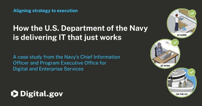
How the U.S. Department of the Navy is delivering IT that just works
The U.S. Navy’s Program Executive Office for Digital and Enterprise Services is working to revolutionize how information technology is acquired.
Progress towards delivering a digital-first public experience
Each year, more than 400 million individuals, families, businesses, organizations, and local governments get information and services from about 430 federal agencies and sub-agencies. The Biden-Harris administration is driving a bold vision for how government agencies serve their customers digitally with OMB’s ten-year roadmap for a modern digital experience. Agencies have already made significant strides. Learn about recent successes by the IRS, CDC, NASA, and FEMA, and how OMB will continue to collaborate with agencies to ensure ongoing improvement in digital government services.— via The White House

Delivering seamless customer journeys
GSA shares a 4-step process used to measure and analyze related websites, and additional plans to improve customers’ digital experience.
Spring 2024 Community Summit
Equity in action: GSA’s study on remote identity-proofing technologies
The Biden-Harris President’s Management Agenda (PMA) emphasizes an effective, equitable and accountable government. As part of this effort, the General Services Administration (GSA) is conducting a study on the equity of remote identity proofing. The study aims to assess and improve the accessibility and equity of remote identity verification technologies such as facial matching systems. Learn more about the context, purpose, and progress of the study, and how it supports GSA’s goal of enhancing digital government services and prioritizing equitable design practices.— via Performance.gov

Getting the word out about voter registration: Vote.gov’s first social media takeover with USAGov
Last fall, vote.gov and the USAGov program partnered for their first-ever social media takeover on National Voter Registration Day. The campaign, which encouraged the public to register to vote, reached 36,000 people across USAGov’s platforms and generated over 2,000 engagements. The partnership raised awareness for vote.gov, boosted vote.gov’s website traffic, and laid the groundwork for the future collaborations and resource-sharing between the two entities. This collaboration between vote.gov and USAGov offers a model for social media takeovers and partnerships between federal agencies and teams.— via USA.gov

Making GSA’s public art collection more accessible
GSA’s Fine Arts team recently leveraged modern product development practices to launch the new collection website.
Delivering on 21st Century IDEA: A case study from the GSA SmartPay team (Part 1)
The GSA SmartPay program, the largest government charge card and commercial payment solutions program in the world, celebrated their 25th anniversary by launching three new websites with a user-centered, agile approach.


