Mythbuster’s Guide to Accessibility: What We’ve Learned About 508 Compliance That All Technologists Can Use
As government technology improves and accelerates, the U.S. Digital Service has the opportunity to improve the most critical public-facing services across agencies. The services and products we create need to be accessible to everyone. Too often, we’ve seen others neglect accessibility because of some common misconceptions that make things difficult. In this post, we’ll debunk these myths, so you can easily create universally accessible content.
Myth #1: Government accessibility is harder than it is in the private sector.
Reality: Accessibility is the same inside and outside the government.
Government accessibility standards are defined by Section 508, enacted as an amendment to the Rehabilitation Act of 1973, to knock down barriers to technology for those with disabilities. (Section 508 talks about all sorts of technology, but in this post, we’ll be focusing exclusively on common consumer tech like websites and apps.)
Section 508 doesn’t have any requirements that wouldn’t also make sense in the private sector. It lines up almost exactly with the Web Content Accessibility Guidelines (WCAG), which is a set of standards authored by industry experts, and backed by the World Wide Web Consortium (W3C).
Section 508 itself is quite simple. The core requirement is that everyone has comparable access to services and products:
[I]ndividuals with disabilities … have access to and use of information and data that is comparable to that provided to … individuals with[out] disabilities. 36 CFR 1194.1
If your app provides comparable access to users with a disability as those without one, then it’s 508 compliant.
Myth #2: Accessibility requires very specific implementations.Reality: Content is accessible when it can be used by users with a disability, period. There are many ways to achieve this. Following a particular implementation pattern is not necessary to achieve accessibility.
WCAG provides the industry-recognized set of standards for accessible content. It’s written as a set of technology-agnostic criteria, such as:
2.4.6 Headings and Labels: Headings and labels describe topic or purpose.
Depending on the context in which you’re building, headings and labels may be implemented in different ways. On the web, for instance, you’d use an <H1> tag for a page heading.
When you’re trying to make content accessible, you may hear that you must use a particular implementation method. This is simply not true — WCAG does not require any particular implementation. Focus on the “what” not the “how.”
Myth 3: It’s possible to build something that’s 100% accessible. Reality: No product is perfect by any metric.
Fixing 100% of reported accessibility defects is not a reasonable goal, just like you wouldn’t expect to ship with zero known bugs or a perfect user experience for users without a disability. How much you invest in UX is a judgement call, and eventually you have to ship. 508 only requires a user experience that’s “comparable” between user with and without a disability; it doesn’t require either of those user experiences to be perfect.
Myth 4: It’s easy to treat accessibility as an afterthought. Reality: Designing for accessibility from the beginning is way easier.
Just like mobile has different design considerations than desktop, so does accessibility. Many designs are going to be onerous to make accessible after the fact. You can save a ton of development time and headaches by baking accessibility in upfront.
Visually-impaired users interact with a UI in a fundamentally different way than sighted users. Sighted users can visually absorb the entire page at once, and quickly jump around to what appears to be the most relevant content. Non-sighted users perceive a page linearly, as a single stream of text served through a screenreader. Designers should consider both methods of interaction. And to validate both these approaches, user testing should be done with both sighted and non-sighted users.
The U.S. Web Design Standards provide guidance for accessibility out of the box. If you’re working for the government, you can start with the U.S. Web Design Standards and know that you’re building on a good, accessible foundation. Additionally, each UI component in the Standards offers guidance for how to ensure accessibility.
Myth 5: Implementing accessibility can only be done by 10x Rockstar Ninja Guru A-Player Front-End Engineers Reality: Accessibility is straightforward for mid-level developers.
If you write semantic, standards-conformant code, you’ll get a lot of accessibility support out of the box. To provide assistive technology additional clues about how your content is structured, you can use ARIA.
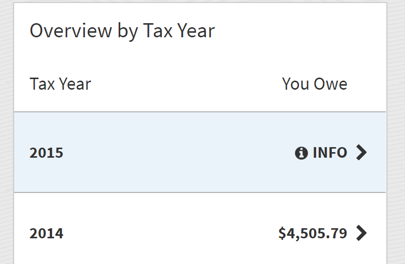
For instance, consider the following table:

To a sighted user, it’s obvious that the title “Overview By Tax Year” is related to the table. However, just by looking at the markup, a screenreader may not be able to draw the same conclusion:
`

