Avoid Weak ‘Links’ in Your Digital Chain
Users don’t like surprises.

agawa288/iStock/Thinkstock
Unexpected or unwanted content undermines the credibility of your agency and frustrates users who come to your website looking for specific information. Using links appropriately in your website content is one way to build trust with users, according to an article by Kara Pernice of the Nielsen Norman Group.
Here’s a real life example: If the link above led to an article about 3D printing, you’d probably be pretty annoyed right now. Using links properly is an easy step that yields real results.
Linking For Good SEO
Links affect the search engine optimization (SEO) of your website, and SEO is important for government websites. Search engines place weight on keywords that are part of links, and linking to credible pages is good for SEO.
Search engines use links to analyze the popularity of websites and pages based on the number and popularity of pages linking to them. They also use links for metrics like trust, spam, and authority, according to Ammie Farraj Feijoo, Manager of DigitalGov Search. Trustworthy sites tend to link to other trusted sites, while spammy sites receive very few links from trusted sources. Grow your link profile to improve your SEO and increase traffic to your website from search engines.
Linking for Good Readability
Links also get attention. Pernice’s eye-tracking research showed that people scan content for elements that will help them achieve their purpose with the smallest amount of reading.
One element people look for is distinct text: when links are differentiated through bolding, underlining, or unique coloring, they catch users’ attention. In fact, research has found that many people don’t read the content surrounding links: they only look at the link itself.
Linking For Good User Experience

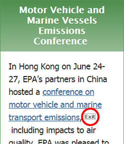
Opinions about linking practices are changing. Recently, a listserv discussion in the User Experience Community of Practice touched on whether links should lead users to a new tab or a new window. Community members also debated whether an icon needs to accompany a link that goes to an external website. For example, external links on EPA.gov have a small “exit” box next to the link.
John Felleman, Industry Specialist for the Common Acquisition Platform Program Management Office in the General Services Administration, shared with the listserv how links open on GSA’s Acquisition Gateway. His office uses different link opening practices, depending on context.
“If we believe that the user is likely to want to continue working in their current environment, we are going to open a new tab or window,” Felleman said. “If the nature of the page they were on is more likely to have been a stepping stone to a more persistent destination, we navigate away. It is not a random ‘every link for itself’ process. We have an emerging pattern of behavior based on links being in main content, or in some sort of left/right/top or modal area.”
Felleman also noted that his personal preference is to avoid disclaimer modals.
“Unless there is a legal obligation—almost never the case—modals provide no value to the user,” Felleman said.
According to Jonathan Rubin, DigitalGov’s User Experience Program Manager, there are varying opinions on these topics, but the type of website an agency has should guide its linking decisions.
“It may depend on the savvy of the users, or what percentage of the content on the site is external,” said Rubin. “For example, much of the content on USA.gov is external, so putting arrows or other icons next to all of their linked content doesn’t make sense. Also, if there are a ton of links, the arrows can create visual noise that makes reading more difficult.”
Rubin emphasized that agencies should conduct usability testing to explore user needs and expectations.
Linking Tips
Here is a list of tips your agency can use when adding links to your content. Linking tips were compiled from Pernice’s article as well as another Nielsen Norman Group article, Writing Hyperlinks: Salient, Descriptive, Start with Keyword.
- Good links are descriptive. If you want to direct users to a page about mobile trends among Hispanic millennials, a link to the keyword “mobile” is too vague and requires users to read more text to understand the context.
- Be concise. Accurately describe the page you are linking to, but don’t go overboard. (This is also a good plain language tactic!)
- Links should be in contrast to the background color and surrounding text. Users are looking for visual cues. The Department of Labor offsets links in red, and when you hover over a link, the text becomes underlined and turns to blue.
- Fix or remove broken links. Broken links frustrate users, undermine your credibility, and negatively impact your SEO.
- Link when necessary, but don’t spam your readers by linking every word.
- Use media format warnings to indicate when a link will connect users to files (such as PDFs or Word documents). Media format warnings can be put in parentheses after the link: several of the links on DigitalGov’s Resources page lead to documents, and we put the warning after the link and offset it with a different color. The amount of information in the media format warning can vary from website to website—at minimum, indicate the type of file the link leads to.
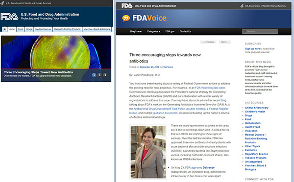
- Link to pages that contain clear headings. Users should immediately see that they have arrived at the correct page after clicking your link. Pernice pointed to the U.S. Food and Drug Administration’s website as a good linking example. The carousel at the top of the homepage displays new articles. Pernice clicked on a carousel story titled Three Encouraging Steps Toward New Antibiotics. When that story was clicked, the page loaded with the correct, clearly labeled article about antibiotics.


