Top Task Usability: Design for Your Users
Being able to design a website that users love is not too far away from being able to read their minds. While designers can’t read minds, that doesn’t stop them from using their website’s top tasks to make it seem like they can.
A website’s top tasks include 5-10 tasks (depending on the scope of the site) that the majority of the website’s users want or need to do on the site. These tasks are the main reason people come to the site and are therefore extremely important to the users, and what is important to the users is important to us. If users can’t complete these tasks quickly and easily they will get frustrated with the site, or even worse they might leave!
For example, if we wanted to look at Digitalgov.gov, some top tasks might be:

As a designer it can be very difficult to put ourselves in our users’ shoes, but a website’s top tasks help designers do just that. Getting a good handle on your top tasks helps you:
- Anticipate user needs
- Guide usability testing
- Target essential website pages
- Design website with user needs in mind
- Identify your website’s mission
- Reduce unused pages
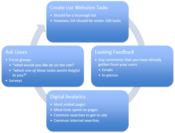
The first step to creating your website’s top tasks is to make a list of tasks that can be completed on your site. After that it is all about figuring out which of these tasks are the most important to your users. Here is a quick guide on how to create your website’s top tasks:

Creating your site’s top tasks is a continuing process, because, what is not important to your users now may be important to them tomorrow.
Testing your top tasks can help you find out what your website can actually do, what features users really want (even if they don’t know it themselves), and can help you figure out what important tasks users are having a hard time finding and/or using. The majority of testing methods for your top tasks can be done using online tools, however, doing an in-person moderated test would yield more qualitative data that can help you better understand your users.
Take a look at Ben Rosset’s blog Using Top Tasks to be Top-Notch: Federal Reserve Board Usability Case Study to view an actual case study that uses top tasks, and get some more specific information on how to test your top tasks. The amount of time it takes to conduct these tests is dependent on how experienced you are. So, the more you do it, the better you will become at it and the less time it will take!
Once you have created your list of top tasks, done your testing, and made design changes that your users will love… Review your top tasks and keep testing! Your users’ needs, or how your users use the website, could change over time. It is important to continually check to make sure your site’s top tasks haven’t changed, and to test your site to make sure it’s performing the way you want it to.
Joël Virothaisakun, a former DigitalGov User Experience intern at GSA last fall, is a graduate student in the Interaction Design and Information Architecture program at the University of Baltimore and a freelance Web designer.

